Tag: watercolour
-

Euromast
Clarkie has joined me for the weekend, and it seems that northern Europe is having a heat wave. We walked around a lot this morning, and then we sat in Het Park while I drew the Euromast. Rotterdam is surprising me. I didn’t know what to expect, but I wasn’t expecting this area of interesting…
-

Rotterdam Stadhuis
This trip has so far been very intense, and I’m not finding a lot of spare time to draw. So this is a rushed sketch of the tower of the Rotterdam Stadhuis, as I can see it from my hotel window. I totally failed to get the right shade of verdigris. And what’s worse is…
-

Mug
This paper really doesn’t seem like it’s right for wet mediums. Ink feels lovely on it (although it takes ages to dry so I keep smudging) but anything with water? Nope. This felt like I was just smearing the pigment around. Anyway. A mug. It looks brighter in person? I’m going to have to try…
-

-

House in the Clouds Revisiting
Thorpeness is a holiday village, envisioned by a single chap back in the 1920s. Kind of an early, British version of Disney without a mouse. It’s full of quirky buildings. This one at least started with a purpose: it was a water tower. Now it’s just a really tall holiday let! I tried to draw…
-

North Sea
We’re on the East coast of the UK, in Thorpeness in Suffolk. It’s a designed village from the 1920s, and it’s very pretty. It’s also right on the coast that suffers serious rates of erosion by the North Sea. This was my attempt at the beach. I’m actually quite pleased with the sea effect. It’s…
-

Embroidery Scissors
I thought I’d try the outline drawing from this video, as a way to test the midori paper with water. I used my embroidery scissors rather than my keys. I have some of the ones shaped like a stork with a nice multicoloured/purple finish, so the colour choice felt appropriate. The paper has behaved ok…
-
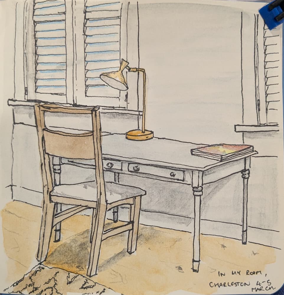
Finishing day
I actually have two today. The first one is yesterday’s picture got finished up and coloured. I think this room is painted pale grey, but it could also be a shady white. So this painting accurately reflects that. The other one that I finally got back to was from last year’s trip to Charleston. I’m…
-
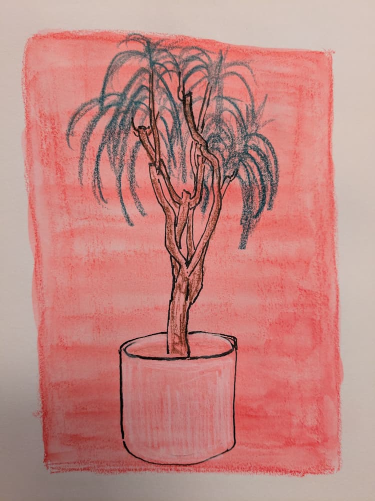
Plant playtime
I wanted to see how my pen would react to a coloured background. And then once I’d done that I thought I’d add some crayon on top too. I’ve not really done colour wash backgrounds much. I see some people use it to take away the scary blank page. Not sure yet.
-
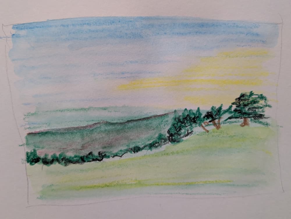
More green hills
Had another go, trying a bit more colour, and having a go at adding some coloured pencil after the background wash. It’s not awful. But I’m not quite where I’d like to be yet. That’s ok.
-
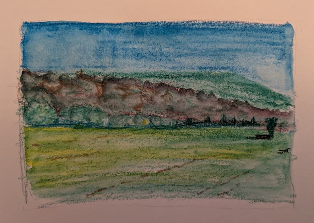
Landscape
Well. That didn’t turn out quite the way I’d imagined! Some experiments work better than others, I guess. The layers on the hills didn’t work, and I’ve not quite got colour mixing. I wonder. Maybe if I did the background with actual watercolours, and then did detail with the crayons and pencils? I might try…
-
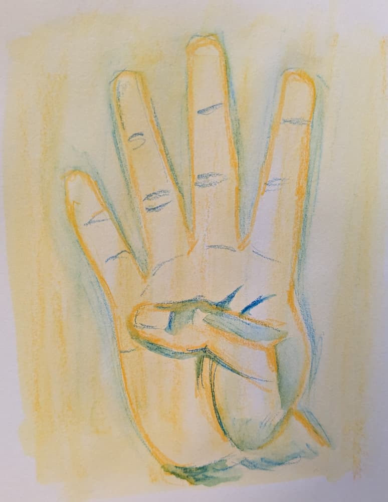
Another hand
Today I tried colouring in the background first, then drawing on top. This is supposed to be orange and blue, but I think the orange doesn’t have quite enough red to be properly complementary. Still, interesting. More playing required. Much, much more playing…